Final Project
Typography - Final Project :

Lecture 11: Typography in Different Medium:
This week's lecture was conducted by Mr. Shamsul, he gave us a presentation on typography in different mediums. It is known that, in the past, typography was only viewed on paper, however, now typography exists not only on paper by on a multitude of screens.
Print Type vs Screen type:
Progress of work:


project 2: Mr Vinod just told me to make the all words the same size but other than this everything is ok.
Week 12:
After showing mr vinod what i sketched and the way i digitizing the my words he said that it do show that its burning but i need to do more adjustments to to flames. other than that i couldn't get any feedback because my laptop suddenly stopped working.
Week 13:
Mr Vinod told me that the animation i made doesn't really express the message i put in my design and he also told me to change the size of the PDF file and make a bit smaller.
(Week 11):Today's class i was a bit confused of what we were supposed to do with our final project specially after Mr Vinod rejected all my sketches .
(Week 12):Today was so stressful since all my work was gone after illustrator suddenly stopped working.(Week 13):Today i was relieved because I had the chance to finalize and print my work and only few things i have to fix.
Observation
(Week 11):I observed that getting a nice idea to work with isn't as easy as i though and it's so much easier to get ideas when i sketch.
(Week 12):I had to do everything again and the time was really limited for me to start all over again.
14/06/19 - 5/07/19

The book had taught me on how to design type. The first step of designing type is to write a short description for the project. Describe our meanings, moods, and feel of the typeface, how it will be used and who will use it. Followed by that we can start to find inspiration. We should study as many typefaces as possible so we can know what is already out there and what has been used to serve similar purpose as our intended design. Followed by that we can start to do preparations such as preparing guidelines. Testing how the letters look in relation to one another is also very important. We may find needs to make adjustments to one or all of them before proceeding.
-

14/06/19 - 5/07/19 (Week 11 - Week 14 )
Rahaf Araman ( 0339378)
Typography
Final Project - Expression, Hierarchy & CompositionLECTURE NOTES
Lecture 11: Typography in Different Medium:
14/05/19 (Week 11)
This week's lecture was conducted by Mr. Shamsul, he gave us a presentation on typography in different mediums. It is known that, in the past, typography was only viewed on paper, however, now typography exists not only on paper by on a multitude of screens.Print Type vs Screen type:
Caslon, Garamond and Baskerville are some of the most used typefaces when it comes to print because of their elegant yet highly readable attributes.
Typefaces that are intended for use on the web are often modified to enhance the readability and performance onscreen in a verity of digital environments. It is key to adjust x-height, open spacing as they improve the overall readability.
Hyperlink is a word, phrase or image that you can click which can take you onto another page or document. Text hyperlinks are often blue in color.
No lecture was conducted:
21/05/19 (Week 12)
INSTRUCTIONS:
FINAL PROJECT
14/06/19 (Week 11):
During this week, Mr. Vinod had told us to think of a social message or issue that is ongoing on our campus and use one of the 10 typefaces or the one we designed to express that in a A3 composition. We can only use one extra color instead of white and black.
I chose to talk about was smoking and i wanted to send a message to smokers that they can't be selfish by smoking in front of other people and effect them with the smoke they are smoking.So i did some sketches but they were rejected by Mr Vinod because he said that my sketches look too visual.


Fig1.1-The sketches i did for the final project
21/06/19 (Week 12):
All my work was gone when i was working on the project during the class because illustrator suddenly stopped functioning and i didn't even have the chance to get a feedback from Mr vinod or get my work approved.
28/06/19 (Week 13):
I had to work on the project from zero again so i worked on it during the week and then i showed it to mr vinod and it got approved.
The message i wanted to send through my work:

Fig1.2
Side profile of a smoker I did using the pen tool:

Fig 1.3
Here i adjusted the placement of the words and i added the smoke and the cigarette:

Fig1.4
Then here i added the colors and a wave effect to the words and the smoke of the cigarette as if its real smoke:

Fig1.5
As seen in the final outcome i dded some curviness to the edges of his profile.

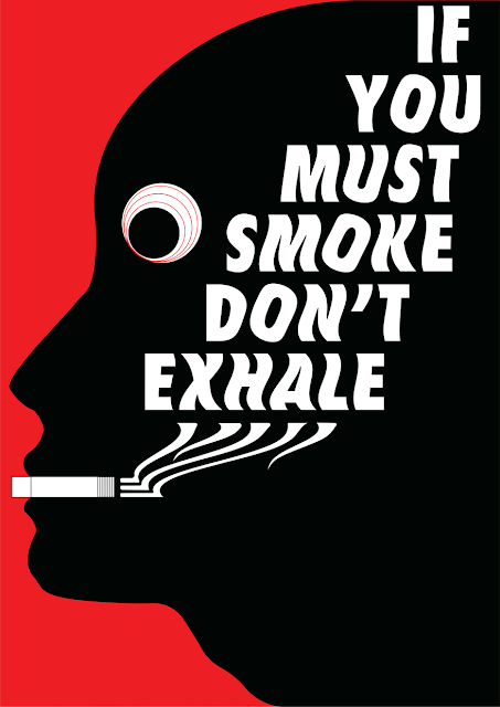
Fig1.6 - Final work
PDF version of the work.

Fig1.7 progress of animating

Fig1.8 Creating the wave effect on the words

Fig1.9 Creating animation using photoshop

Fig1.10 Final Work


After the feedback i got from Mr Vinod I tried to change the animation again.

Fig1.11 - 2nd attempt

Fig1.12 - 3rd attempt

Fig1.14 - Final work
The print came out really nice,but it was hard to take a clear picture because the reflection was bad:

Fig1.5
FEEDBACK
Week 11:project 2: Mr Vinod just told me to make the all words the same size but other than this everything is ok.
Final Project : After showing mr vinod my sketches he told me that my sketches look so visual and i need to make it more simple and he showed my some examples of how it is supposed to look.
After showing mr vinod what i sketched and the way i digitizing the my words he said that it do show that its burning but i need to do more adjustments to to flames. other than that i couldn't get any feedback because my laptop suddenly stopped working.
Week 13:
Mr Vinod told me that the animation i made doesn't really express the message i put in my design and he also told me to change the size of the PDF file and make a bit smaller.
REFLECTION
Experiences(Week 11):Today's class i was a bit confused of what we were supposed to do with our final project specially after Mr Vinod rejected all my sketches .
(Week 12):Today was so stressful since all my work was gone after illustrator suddenly stopped working.(Week 13):Today i was relieved because I had the chance to finalize and print my work and only few things i have to fix.
Observation
(Week 11):I observed that getting a nice idea to work with isn't as easy as i though and it's so much easier to get ideas when i sketch.
(Week 12):I had to do everything again and the time was really limited for me to start all over again.
(Week 13):Since i had some troubles with my work the previous weeks and the lack off time i had to animate in a rush and the result was as good as i want.
Findings
(Week 11):Always ask before its too late.
(Week 12):I learned a lesson to always save my work after at least every 15 minutes of working.
Findings
(Week 11):Always ask before its too late.
(Week 12):I learned a lesson to always save my work after at least every 15 minutes of working.
(Week 13):Always do your work on time because doing work on a rush will not give the expected results.
FURTHER READINGS:
Week 11 - Week 1414/06/19 - 5/07/19

Fig2.1 - Exploring Typography

Comments
Post a Comment