MINOR PROJECT - SELF REFLECTIVE JOURNAL-
27.11.2020 - 26.11.2020 (Week 11 - Week 14)
Rahaf Araman (0339378)
Minor Project
Self Reflective Journal
INSTRUCTIONS
This post contains a compilation of the exercises tasked to us, aiding in the process and techniques of presenting our own products and designs, communicating with our teammates and getting a better understanding of how to handle projects.
Tracking Document:
Miro Board Link:
Module Brief:
The first meeting was held on campus so I had to attend it online since I'm still in Syria. However, during the class Dr Edwin and Mr Mike gave us a brief about the projects that we will be working on in a group. For this module, we had to work with student from other schools such as the Computing School and Business School.
There were 4 projects and we had to choose either one which are: Location Based Advertisement System, LPG Ordering System, Mud Card Class Feedback System, and Autism Education.
After the meeting, we had to choose the project we want. each group should have 6 people with at least 2 or 3 different specialization. I chose the first project, which was the location based advertisement along with 2 graphic classmates, 2 entertainment classmates and another one from animation. We had not yet discussed on the project as the other schools were not present and we could not grasp the idea of the project.
Reflection: This week I felt nervous and confused yet so excited for many reasons, First, because I found that doing such a project was really new to me which will allow me to have a new experience on something I have never done before. Moreover, I was confused about what the final goal to achieve from this project, but I didn't worry about it a lot because I knew that this is still the first week and its fine to not get everything from the first day specially that I couldn't have the chance to attend the physical class like my classmates which was a bit hard to keep up with the class specially with the internet problems I face.
Week 2 :
3/9/2020
This week Mr. Mike explained more to us about the project and what is expected from us. He also advised us to do some research about Out of Home (OOH) company to see how they advertise their product. After we have made research we found that this company provide different services from billboard to digital screen as it advertises the outdoor boards we usually see on the streets and buildings. Moreover, as an outcome of this research, we had a clearer idea about advertising on a outdoor billboard screen but the problem is about the way to apply the geolocation idea to that.
Reflection: For this week, we have done a research on OOH company, even though it was useful but I still feel that we aren't progressing much as we are still not clear enough beside the lack of informations from the 2 other schools we are cooperating with. I believe that both our school and their schools should stay in touch as every single information could be so useful for both sides since we are working on the same project.
10/9/2020
This week, me and my group mates were trying to fill out the project's tracking document according to the informations we have regarding this project so far.
The parts we filled for now are : Defining the challenge, Creating the project plan, Challenge analysis, Target Audience, and Empathy.

Reflection: At the beginning and after having a meeting with my group mates to fill the tracking document, I thought that we had a clear idea about the final goal and outcome of this project. But then I got confused from the feedback my group mates got during the class as the project turned out that it's not what we were expecting to do. I also struggled a bit because of the time difference between my country and Malaysia as I couldn't meet Mr. Mike like my group mates and had to wait for them to inform me about the feedback we got.
This had an alignment meeting with Mr. Edwin and finally had a grasp on the project. He suggested we design the app/website in a way that attracts passive users and a way to make the screen interact for the user to have a chance to go to the place that is advertised. He also asked us to find out how long should a video play? How many words should it carry? What's the resolution size, the size of screen? Once in the vehicle, how does it play? How to make sure it plays when there is a customer? How the passive user retains the ad info to visit the business advertised? How can it be different? What is the basis?
 |
Grab Car Business (https://www.grab.com/my/business/ads/)
|
We looked up on the competitors, which was Rodeo and researched the potential sponsor, Grab car as well as on the ad requirements. Rodeo is an on-demand advertisement technology company that works with transportation such as cars, motorcycles and lorries, which carries the Advertiser's brand. There was an article Rodeo, it wrote that Rodeo is planning to collaborate with Uber to expand advertisement opportunity. So, I would assume why the team decided to have Grab car as a sponsor as they offer in-car branding.
 |
Ads refence and Attention span
|
Articles Links:
Ad References:
Geofencing:
I researched on the time requirements of an ad should be and additionally the time required on user's attention. An ideal time for an ad to play is 14 seconds and the user's attention is about 1.5 to 3 seconds.
We had an idea about making an animation for the ads about 15 seconds as we had animation classmates. Meanwhile, for the IT side, they plan to use a platform called Firebase and a service called Geofencing, which is a service that uses GPS, RFID, Wi-Fi or cellular data to trigger an action when a device enters a set location and has the minimum radius of 100. They also required an tablet with an Android OS, has touch screen function and a GPS receiver.
We made a survey to collect data on user experience, we used Google Forms. We manage to have 116 responses from the survey. From the survey, we found that most people use Grab as e-hailing service and use e-hailing services in the afternoon. They would also seat in the back of the car because they feel safe or comfortable and would use e-hailing services to go to the mall most often. They like promotion on advertisement because they would save cost and would be attracted to food advertisement. Unfortunately, they won't scan a QR code because they are not interested.
This is a link to the survey questions and results: Spreadsheet
Reflection: Other than feeling confused from last week, this week I started to feel that we are falling behind after seeing the computing and business teams progress and even thought we knew that we had to focus on the user experience yet it felt that there wasn't much to provide to this project from our side as a design team compared to the work needed from the computing and business teams.
24/9/2020
We planned to have the screen place on the headrest of the car so that the user would see and interact with. For the QR code, we wanted to encourage the user to scan the QR code with a puzzle for them to solve while for the video, we had an idea for it to be an interactive video to have it more engaging.
After the the consultation with Mr Mike, he advised us to research on OOH inside and outside of Malaysia to study how they work with advertisement and make the advertisement video we're working on different from YouTube ads.
 |
Ideas for the headrest and QR code
|
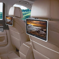 |
| Reference of a headrest screen |
After the the consultation with Mr. Mike, he advised us to research on OOH inside and outside of Malaysia to study how they work with advertisement and make the advertisement video we're working on different from YouTube ads. We did some researched on the two companies and we found that Rodeo didn't have any information on how they advertise their products and we found Octopus much more engaging as it has games to win prizes.
Playoctopus
Reflection: We thought that this project/Idea wasn’t done by anyone before but then we found out about companies that are doing the same product such as Rodeo and also a company called Play octopus. I didn’t consider that as a problem but as an advantage to us to study about these companies and their strategy which can be very helpful for us and our project, as it also allows us to think about ideas that weren’t done by them in order to provide a unique product.
What we know about Octopus:
For riders:
- Live games (realtime trivia, daily giveaways and cash prizes)- Ride information (driver profiles, weather and other local info)- Interactive ads (premium video for a highly engaged audience)- Real time access to campaign performance via mobile or desktop- Interactive experience that yields higher CTRs than other publishers- Fully interactive (sight + sound + motion)- 100% viewability- 100% Video completion rate- Location-based ad delivery- Daypart targeting
For drivers:
- Can apply for free tablet (with free mounts and free LTE data, and cash earnings for driving with tablet)- Extra earnings (more tips and direct earnings from Octopus)- Higher driver ratings (games make rides more fun and boost ratings)- Better conversations (connect with passengers)
3 Personas and Journey Maps:
1. Students
Name: Alex Tan 👼
Age: 20
Gender: Male
Status: Single
Level of education: University student (Undergraduate)
Occupation: Student
Monthly income (pocket money): MYR1200
User location: Home
Likes: Hanging out with friends, shopping for sneakers, playing games
Dislikes: Going out buying groceries, hates reading, smoking
Scenario: “I like to buy sneakers when shopping with friends. Usually we take Grab because it is more convenient to go directly from home to the shopping mall rather than walking to the nearest LRT station. I am a student, but my parents give me quite a big allowance for my sneaker addiction. If there are limited edition sneakers in stores, I will most likely chase them. I always save my money for my sneakers, so I try not to spend much on food.”
2. Young working adults
Name: Priyanka Deepika 👩🏾
Age: 29
Gender: Female
Status: In a relationship
Level of education: Bachelor in Arts in Humanities and Social Sciences
Occupation: Senior Copywriter
Monthly income: MYR5500
User location: Office
Likes: Fitness, Movies, going out for drinks with friends, financial planning, discounts, karaoke, meeting new people
Dislikes: Sweet drinks, dogs and cats(allergic)
Scenario: “I like watching movies after getting off work with my friends. So, we take Grab to the mall to catch a movie and after that, we go out drinking. However, we have a hard time choosing a movie and getting snacks. We also have a hard time deciding which bar to go to afterwards.”
3. Middle-aged adults
Name: Gary Brown Abdulah 👨🏻🔬
Age: 55
Gender: Male
Status: Married, two kids
Level of education: Doctorate in Mechanical Engineering
Occupation: Mechanical site engineer
Monthly income: MYR 10,000
User location: Office, sometimes worksites
Likes: science, golf, old movies, gardening, driving, walks in the park, coupons and saving money
Dislikes: arts, being old, driving at night, meeting new people
Scenario: “I prefer to take a Grab if I’m working late nights at the office but because of my old age, my astigmatism makes it hard to drive with all the car lights. I like to drive but my poor eyesight makes it more risky for me to drive at night. I find it hard to focus on the road, and you never know where there's a good discount. It’s always important to save money!”
The IT team wanted a wireframe design for the driver's login page so Jason made 3 samples for them and preferred the first design:

The 3 designed wireframes
Reflection: After the consultation with Mr. Mike, we were asked to study more about the user experience of the passengers and the way they would interact with the device by creating a customer Journey map. I didn’t really know how to create one as it was out of my specialization but luckily from the videos that were provided by Mr. Mike and with the help from 2 of my group mates who are graphic designers and have already studied about this, I was able to understand how its done and the purpose of it. I also had another meeting this week with my group mates in order to decide and discuss our logo design and the color palette we are going to use.
This week we held a meeting to decide our brands name, there were so many options we found but at the end we chose to name it Redux which means: Fortuna Redux: one aspect of the goddess Fortuna in Roman mythology was similar to Adiona, being another goddess for the Romans to call on for a safe return journey.
The next step was to design the logo for our brand, therefore, each one of us created few sketches for logos, we also decided during the meeting which color palette we will be going with.
Few Sketches done by everyone
Color scheme we chose to apply to the logo
We decided to go with Jason's logo, The idea of his logo was to abstract "R" and it has the location logo, so the design seemed to fit for the brand idea and the it's name of the brand so he worked more on refining it and to come with more advanced styles.
 |
| Old Designs |

New Designs
After the feedback from Mr Mike, Jason made more changes to the logo, the same triangle is replaced with a tagline, the purpose of the tagline is to represent advertisement because our goal was to let users be attracted to the ads. Mr Mike also asked us to complete a flowchart for the application.
On the other hand, me and Desmond did a research about the suggested company by Mr Mike "Play Octopus" as Mr Mike asked us to study about this company and use their system as a reference for ours, Therefore Me and Desmond did a research on how Octopus gives out prizes after winning the game. If the user achieved the highest score on any game they would have a chance to win the prize, but to do so they would need to input their phone number to be informed.

The informations we found and posted on Miro
As a result, the research we have done regarding play octopus was very helpful as it helped us to figure out how we are gonna plan the system out, so we created a flowchart for clearer image:
Flowchart game plan
After the feedback from Mr Mike, Jason made more changes to the logo, the same triangle is replaced with a tagline, the purpose of the tagline is to represent advertisement because our goal was to let users be attracted to the ads. Mr Mike also asked us to complete a flowchart for the application.
On the other hand, me and Desmond did a research about the suggested company by Mr Mike "Play Octopus" as Mr Mike asked us to study about this company and use their system as a reference for ours, Therefore Me and Desmond did a research on how Octopus gives out prizes after winning the game. If the user achieved the highest score on any game they would have a chance to win the prize, but to do so they would need to input their phone number to be informed.
Moreover, me and my groupmates have created another survey because the previous one wasn't enough and missed so many points specially after the different researches we have done that made us find that there still some points left to know in the second survey.
Reflection: Me and my groupmate have done research about Octopus’s live game prizes and their system which was very beneficial to our project and eye-opening to a lot of different helpful points when it came to designing the questions for our survey and also the way we can make the questions related to the project’s objective.
After a few days, Angelina and Wan Min collected and analyzed the survey we got. We had 76 responses and most of them were at the age group of 15 - 23, unfortunately, we could made it up to a 100 responses. However, the data was enough for our research. We color coded the age group and looked through all the surveys, we put the analysis on our Miro board.
This is a link to the survey questions and results: Spreadsheet
Data analysis on Miro Board
Survey Analysis:
Age 15 - 23
Ride Grab (once a month [30/55], once every 2 weeks [16/55]) [7/55 not taking Grab]
Majority rides alone, few with friends [13/55]
Mostly in afternoons and evenings, some mornings
Majority go to Sunway Pyramid [34/55], some to Mid Valley and IOI City Mall
Most go for dining [20/55] and entertainment [11/55], some fashion and grocery
People are mostly attracted to sales and discounts, then coupons and a few for product sampling
Would be inclined to purchase what is offered when seeing a promotion or discount
Would play an on-screen game to wing promotional vouchers/discounts
Would scan a QR code for info on discounts from the on-screen ad
Age 24 - 34
Ride Grab (once a month, once a week) [2/9 not taking Grab]
Majority rides alone, some with friend
Mostly in the afternoon, some at night and evening
Most of them go to (Mid Valley, Sunway Pyramid)
Most of them go for dining, some for entertainment
Mostly attracted to discounts and sales
Would be inclined to purchase what is offered when seeing a promotion or discount,
Would play an on-screen game to win promotional vouchers/discounts,
Would scan a QR code for info and discounts from the on-screen ad
Age 35 and above
Ride Grab (once a month, once a week) [1/11 not taking Grab]
Majority rides alone,
Mostly in the afternoon,
Majority go to Sunway Pyramid,
For (grocery, dining, fashion),
Mostly attracted to sales,
Would be inclined to purchase what is offered when seeing a promotion or discount,
Would play an on-screen game to win promotional vouchers/discounts,
Would scan a QR code for info and discounts from the on-screen ad
Overall from the survey, almost all the responses would be inclined to purchase what is offered when seeing a promotion or discount, would play an on-screen game to win promotional vouchers/discounts and would scan a QR code for more information and discounts from on-screen ad.
Also Syaqiel and Jason finished working on the Customer Journey Map which was also required to finish this week:

Customer Journey Map on Miro
Reflection: As a result of this week’s meeting with Mr. Mike, our direction of work toward this project has changed, because what we can provide to the project was too simple compared to the amount of work we are expected to do for this module. Moreover, we analyzed the response we got from the conducted survey as we got really useful answers that could enhance and understand more how our user experience should be.
22/10/2020
This week me, Desmond and Wan Min worked on the wireframe meanwhile Jason and Syaqiel were doing the art direction for the UI and Angelina was keeping track on the tracking document and is flexible, she would help either side.
Wireframe created on the Miro Board
We also created a flowchart to know what is the approximate time that the user would take to finish the whole process added to that the ads time. Therefore we found out that the time it will take for the game to play and estimated how many ads would be played.
Time Flowchart
Reflection: This week me and my group mates discussed the flowchart, UI design, and the wireframes. We divided the tasks according to each groupmate's strengths in order to save time and be able to do as much work as we can. And we were able to complete the first draft of the wireframes.
This week we continued to work on the moodboard of the UI design and have the Jason's refined logo and the typeface for the heading Berlin Rounded and Pragnea as the body text. After comparing the geometrical shapes and organic shapes, we find the organic shape more appealing.
Key Art Ideas
Reflection: For this week we had to discuss the mood board, logo finalization, and the art direction in order to apply it to the mockup. Syaqiel was assigned to complete the art direction. We decided which of the provided typography we are going to use for the header and the body. We also discussed the color pallet and the kind of shapes would look good with our brand.
After the consultation with Mr Mike, he had advised us to have a stronger rationale to support the visual communication decision for the logo with that, Therefore, to help Jason each one of us have created 2 sketches so we can chose one between all the sketches to go with. For my logo I wanted to design something really direct and easy to understand, So I designed it by creating a negative space of the letter R from the location symbol and added an arrow in the middle.
Logo Sketches and development on Miro
My Logo
In the end, we decided to chose Jason's new refined logo. It looks unique and the "R" is in the shape of a silhouette person to show that the person is looking at the screen and is engaged to the games we provided.
Jason's Logo
Reflection: After the discussion with Mr Mike and from his feedback on the logo, we decided to change the whole design. Therefore, each one of us created 2 logos to show in our next group meeting. For my logo I wanted to design something really direct and easy to understand, So I designed it by creating a negative space of the letter R from the location symbol and added an arrow in the middle. After showing our designs to each other during the group discussion we decided to use Jason’s logo.
Wan Min and I recreated the wireframe we had on the Miro in to Adobe XD and link a few things. Wan Min tried to recreate the game spot the difference by linking the wireframe one by one. Since there were many possibilities, After that, Angelina asked some of her friends to test the wireframes to see if they are working fine.
After the testing, my friend told me which part of the game wasn't working and fixed it on the spot. Angelina collected some good feedback from her friends, it was about the leaderboard, they were not clear of the purpose of it and didn't know which part to press on the game spot the difference because I only link 1 part of the side.
Mr Mike suggested to have side one name "spot the difference" and the other "original", however, as both side could be the original and we can leave it as it is because it was a prototype for testing. He also told us to have an explanation or instruction of how the game works and how they could win prizes. In addition, to check the size of the buttons and also the gap/spacing of the button.
User testing Link:https://xd.adobe.com/view/c301b504-d0d5-4ae3-af2c-517e2422b292-9652/?fullscreen&hints=off
Home screen layout (Adobe XD)
Prototype
At the same time Desmond focused on the website, he created an explaining flowchart and the wireframes :

Website's Flowchart
Website's Wireframes
Reflection: There were some ups and downs during this week. We struggled with the logo and how we can make it match Mr Mike’s feedback. On the other hand We were also able to get the flowchart of the website and collateral website done, Even the results and feedback of the wireframe testing were really positive with only small minor changes needed.
This week we got a feedback from Mr Mike regarding the Logo, he said the logo we chose should be easier to understand and more straight forward as he suggested to us the logo I designed instead because it covers all the sides we want to put in a logo and more straight forward to the purpose of our brand. Therefore, he asked us to either use mine and replace the arrow with a play button or to come with a stronger rationale if we want to stick with the one we are currently working with.
Current Logo
Mr Mike's Suggestion (My Logo)
We have a logo rationale on why we chose the design and it's because it's the rounded edges and elements are to create a sense of approachability compare to the sharp edge of the "R" which looks too aggressive.
 |
| Comparison |
Also Mr Mike gave us a feedback regarding the mockup we did on XD, he pointed that the design should be more consistent, he also suggested that the Home screen ,‘Weather’ and ‘local news’ need to be as rounded as ‘game center’ icon (radius curve); spacing between buttons needs to be accurate, also shouldn’t put at the edge of the screen border and need to be centralized the icons and be consistent.
Mockup on XD
Reflection: After this week’s consultation me, Wan Min and Angie had to fix the mockup draft we showed to Mr Mike according to his feedback. Therefore, we decided to do everything again on Figma instead of XD due to the several problems we faced while using xd. I truly found it easy to use Figma and the mockup looked way better and much more consistent.
Because Adobe XD was inefficient to use and reduce the size of the screen to (1280 x 800px) from (1920 x 1080px). Me, Wan Min and Angelina restarted the whole application mock-up again on Figma instead of XD, as Figma was much more easier and faster, we could see each others cursor, just like Miro, we noticed other problems too while using xd so we decided to start clean and will applying Mr Mike's feedback notes on Figma.
Mr Mike also suggested us to use a more fun and playful font for the games section, therfore Syaqiel provided us with 3 fonts to chose from. The Majority like XPLOR as the Fun Font, as it seems much more engaging to look at so we went with it.
After Mr Mike saw our new mockup on Figma, he said that there were no problem, just some minor changes and have more advertisements to show how brands can advertise with us and also be clear on the destination-based ads.
Application Mock-up link:https://www.figma.com/proto/Xwpz78RYVD9VTOL96xdkYP/Redux_Minor-Project_App-Final?node-id=2%3A11&scaling=min-zoom |
| Application Assets |
 |
Application Mock-up Overview
|
On the other hand Jason focused on Finning the Ads and Desmond was completing the website:
 |
| Website Mock-up Overview (By Desmond) |
 |
Advertisement Mock-up (By Jason)
|
Reflection: This week was our final consultation week. We got feedback from Mr Mike on our work such as the website and the mockup. He also pointed out what we are expected to submit as final and gave us an extra week to finalize everything and fix all the small problems he mentioned. I think that this module was so different from anything I have done before, I consider it as a very good experience to learn from which I believe it's going to be extremely beneficial for me in the future.
4/12/2020
Proposal and Final Slides Submissions:


Comments
Post a Comment