Project 1
ADVANCED TYPOGRAPHY - PROJECT 1:
Rahaf Araman (0339378)
Advanced Typography
Project 1 - The Troublemakers Manifesto (Key Artwork)
LECTURE NOTES
Lecture 5: Typographic Perception & Organization
23.9.19 (Week 5)
Today's lecture was presented by a group of our classmates .
The Topic was about: Typographic Perception & Organization it consisted of three sub-topics which were Form and Contrast, Gestalt Psychology and Layout, and Creating Visual Hierarchy.
Lecture 6: Typographic Composition
30.9.19 (Week 6)
• Environmental Composition
• Environmental Grids
• Alternate methods of determining the composition
Lecture 7: Typography in Different Mediums
7.10.19 (Week 7)
Today we learned about typography in different mediums.
INSTRUCTIONS
PROJECT 1 - The Troublemakers Manifesto Colloquium (Key Artwork)
For our first project, we had to create a key artwork of an academic conference called The Troublemakers Manifesto: A Design Colloquium. It will later be used across the collaterals. The collaterals will range from:
- Poster (Static 50 X 70 cm and Animated)
- Invite (Interactive)
- T-shirt, Sticker, Pin Badge, etc.
We were also given the meaning behind The Troublemakers Manifesto: A Design Colloquium to refer to when brainstorming the concept.
The conference seeks to provoke inner dialogue of one's beliefs and to create a new paradigm shift through alternative viewpoints.
Troublemakers often make others feel uncomfortable. They challenge the norm, they question establishments rules and the status quo. This tension is needed to break the monotony brought about by societal conformity to the diktats of those wielding influence.
To most people, troublemakers are not a welcome lot but without their disruptive tendencies - creating ripples and ruffling feathers - unspoken ideas will not be made known, and innovations will not come to pass.
Why do they do, what they do? What principles and values lie beneath their decisions and actions? Are you a troublemaker, if so what is your manifesto?
Week 6 :
30/9/19
After hearing the term "Trouble Makers Manifesto" all the ideas I had in my head were either scary or gothic.
First Attempt:
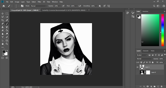
fig 1.1 - Image used
Removing the background using photoshop:
fig 1.2
Here I cropped the nun and placed on a white background then I fixed her scarf using the brush tool:
Next I selected the nun using the quick selection tool and I added the letters, adjusted there positions, changed the color and add a layer mask on them . Therefor, I deleted some parts of the letters to play with the look of the letters on the nun's image.
Final:
Fig 1.3 - Final composition
2nd Attempt:
Fig 1.4
3rd Attempt:
Fig 1.5 - chosen Image
The reason I chose this image is because butterflies are deep and powerful representations of life and around the world, people view the butterfly as representing endurance, change, hope,freedom, and life. so in my opinion and after listening to Mr Vinod's feedback about how "troublemakers" wants to bring a change and it is for the good i felt that this image represents the significance of this term.
Fig 1.6 - Background removed
Here i was trying to find a suitable placings for the letters:
Fig 1.7
Fig 1.8
Final composition:
Fig 1.9 - Final composition
Fig 2.0 - Final pdf version
FEEDBACK
(Week 6)
General Feedback:
Mr Vinod told us that to developed a proper key artwork we need to understand the meaning behind 'manifesto' (which are our beliefs). We also need to have different ideas and designs so we would have back up if our main ideas do not work well. Do not use lightbulbs as our ideas because it is too commonly known for positivity. Moreover, do not use a black background because we need the key artwork to stand out.
Mr Vinod told us that to developed a proper key artwork we need to understand the meaning behind 'manifesto' (which are our beliefs). We also need to have different ideas and designs so we would have back up if our main ideas do not work well. Do not use lightbulbs as our ideas because it is too commonly known for positivity. Moreover, do not use a black background because we need the key artwork to stand out.
Specific Feedback:
All my design got rejected because I misunderstood the term "Trouble Makers Manifesto" and I made my design based on the literal meaning of the term , so Mr Vinod and Mr Shamsul advised me to do explore more and try to understand more what a "Trouble Makers Manifesto" really means.
(Week 7)
General Feedback:
For typographic systems make sure to have a an outline around the spreads. Do not put them in individual pages. The PDF (in spreads) must be made public and visible. For finding type exercise we need to put every refinement process on a baseline. Make show to show first refinement and last refinement. The lecture notes must be summarised, embedded and completed.
Specific Feedback:
My design got approved but Mr Vinod and Mr Shamsul told me to vectorize the image and adjust the letters positions in illustrator not photoshop.
REFLECTION
Experiences
(Week 6):The project wasn't easy as I thought, my work got rejected even though I thought it was good.
(Week 7):After redoing my work so many times I started to see how bad my first attempt looks even thought i thought it looked good in the beginning.
Observation
(Week 6):Having different ideas and designs is really useful cause it can be a back up if my main idea didn't work well.
(Week 7):Getting the perfect idea from the first time doesn't work , I need to try and try to find the best idea for me and progress can be seen after each try.
Findings
(Week 6):Most of my classmates struggled to doing their work too, since they didn't understand properly the given term.
(Week 7):Looking for references is super helpful to get to ideas and inspirations.


Comments
Post a Comment