Exercises
ADVANCED TYPOGRAPHY - EXERCISES

26/08/19 - 30/9/19 (Week 1-Week 5)
Rahaf Araman (0339378)
Advanced Typography
Exercises
LECTURE NOTES
Lecture 1: Introduction to module & Typographic Systems:
26/08/19 (Week 1)
In the first class, we were introduced to this module 'Advanced Typography' by Mr. Vinod and Mr. Shamsul, the same lecturers in Typography class in the previous semester.
Then, we started the first lecture class, 'Typographic Systems'. We were divided into 4 groups, and each group had to prepare a presentation about 2 typographic systems assigned by the lecturers.
The 8 Typographic Systems are:
1. Axial
2. Radial
3. Dilatational
4. Random
5. Grid
6. Modular
7. Transitional
So this is the presentation slides about the Axial and Radial Systems.
This is the presentation slides for the Dilatational and Random Systems.
Lecture 1: Introduction to module & Typographic Systems:
26/08/19 (Week 1)
In the first class, we were introduced to this module 'Advanced Typography' by Mr. Vinod and Mr. Shamsul, the same lecturers in Typography class in the previous semester.
Then, we started the first lecture class, 'Typographic Systems'. We were divided into 4 groups, and each group had to prepare a presentation about 2 typographic systems assigned by the lecturers.
The 8 Typographic Systems are:
1. Axial
2. Radial
3. Dilatational
4. Random
5. Grid
6. Modular
7. Transitional
8. Bilateral
This is the presentation slides for the Grid and Modular Systems.
Lastly, this is the presentation slides for the Bilateral and Transitional Systems.
After our presentations, we had to create two designs for each of the 8 typographic systems on inDesign.
Lecture 2: No lecture
2/9/19 (Week 2)
This week we didn't have lectures because we were focusing on finalizing our 16 typography system layouts. Mr Vinod also told us about our next exercise which is called type and play - part 1 where I explained more in my exercises.
Lecture 3: No lecture
9/9/19 (Week 3)
Today we got our feedbacks for our dissected letterforms and Mr Vinod introduced our next exercise which is type and play - part 2
Lecture 4: No lecture
16/9/19 (Week 4)
Today we didn't have class because it was a public holiday.
Lecture 5: Typographic Perception & Organization
23/9/19 (Week 5)
Today's lecture was presented by a group of our classmates.
The topic was about: Typographic Perception & Organization it consisted of three sub-topics which were Form and Contrast, Gestalt Psychology and Layout, and Creating Visual Hierarchy.
EXERCISES
Lecture 1: Typographic Systems on Indesign:
26/08/19 (Week 1)
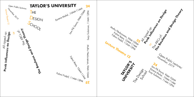
For our first exercise, we had to design 2 designs of the 8 typographic systems using InDesign.


Exercise 2: Type & Play
02/09/19 (Week 2)
For this Exercise, we must select an image it may be (human, landscape, nature or everyday items such as a chair, lights etc.) After that, we should analyze the image and trace and then dissect it to find potential letterforms.


After extracting the 5 letters, I began to refine them. I used Universe LT Std as a reference for the type.


Work After Feedback:
So after getting the feedback I had to refine the letters again to look more like the "P" since Mr Vinod told me that the "P" looks the best.


(Week 2):Mr Vinod approved the designs but he told me to keep in mind that everything must be inside the margins so i fixed that.
(Week 3):Absent
(Week 4):No class.
(Week 5):For the letters exercise: Mr Vinod and Mr Shamsul told me that to refine the letters to look more like the "P" cause they said that it looks the best. Then Mr Shamsul approved the "L" and "C" after fixing them and told me to fix the "A".
REFLECTION
Experiences
(Week 1): I felt a bit stressed since we didn't have a lot time to prepare the presentation.
(Week 2): It was really hard to complete and to come up with all the designs in one sitting so i did it in two days in a row but my neck kept hurting for a whole week after that.
(Week 3): This week's exercise was a little bit hard for me specially when when it came to choosing the image, and dissecting the image, it took me quite some time to dissect the image.
(Week 4): Public holiday so we had to continue working on the last week's exercise.
(Week 5): I felt so pressured since I wasn't done the last week's exercise and Mr Vinod rejected my Type and Play exercise.
(Week 1): My classmates were really good at understanding and catching up all what was said during the presentations since they answered almost all the questions after each presentation.
(Week 2): There was some confusion about the modular system but Mr Vinod cleared everything again in this week's class.
(Week 3): By doing the exercise, I observed that refining the alphabet but still retaining the essence of the original was not an easy thing .It requires a lot of refining cycle to get to the perfect stage.
(Week 4): Public holiday so we had to continue working on the last week's exercise.
(Week 5): I found that finding a good photo with the right word with a nice placing of the word isn't easy at all.
Findings
(Week 1):I need to train my self to be more confidant and comfortable about presenting in front of my classmates.
(Week 2):Hard working with time management is really important, otherwise it will be very hard to complete the task you were given in the last minute.
(Week 3): I realized that actually everything that around us can be any kind of letterforms but I never noticed that.
(Week 4): Public holiday so we had to continue working on the last week's exercise.
(Week 5): I found out for the exercise I struggle a lot, I struggle in finding the ideas and the beginning part when understanding the exercise.
This week we didn't have lectures because we were focusing on finalizing our 16 typography system layouts. Mr Vinod also told us about our next exercise which is called type and play - part 1 where I explained more in my exercises.
Lecture 3: No lecture
9/9/19 (Week 3)
Today we got our feedbacks for our dissected letterforms and Mr Vinod introduced our next exercise which is type and play - part 2
Lecture 4: No lecture
16/9/19 (Week 4)
Today we didn't have class because it was a public holiday.
Lecture 5: Typographic Perception & Organization
23/9/19 (Week 5)
Today's lecture was presented by a group of our classmates.
The topic was about: Typographic Perception & Organization it consisted of three sub-topics which were Form and Contrast, Gestalt Psychology and Layout, and Creating Visual Hierarchy.
INSTRUCTIONS
EXERCISES
Lecture 1: Typographic Systems on Indesign:
26/08/19 (Week 1)

Fig 1.1 - Axial

Fig 1.2 - Radial

Fig 1.3 - Dilatational

Fig 1.4 - Grid

Fig 1.5 - Transitional

Fig 1.6 - Random

Fig 1.7 - Bilateral

Fig 1.8 - Modular
02/09/19 (Week 2)
For this Exercise, we must select an image it may be (human, landscape, nature or everyday items such as a chair, lights etc.) After that, we should analyze the image and trace and then dissect it to find potential letterforms.
The image I chose is an Arabic calligraphy at Wazir Khan mosque in Pakistan:

Fig 2.5 - Arabic Calligraphy

Fig 2.6 - Dissect lines with the picture

Fig 2.7 - Dissect lines without the picture

Fig 2.8 - Dissection in Illustrator
The next step was finding the letters:

Fig 2.9 - Letter A

Fig 3.0 - Letter X

Fig 3.1 - Letter P

Fig 3.2 - Letter L

Fig 3.3 - Letter C

Fig 3.4 - The extracted letters

Fig 3.5

Fig 3.6 - Progress
Work before Feedback:

Fig 3.7

Fig 3.8

Fig 3.9

Fig 4.0

Fig 4.1
So after getting the feedback I had to refine the letters again to look more like the "P" since Mr Vinod told me that the "P" looks the best.

Fig 4.2 - Letter "A"

Fig 4.3 - Letter "C"

Fig 4.4 - Letter "P"

Fig 4.5 - Letter "L"

Fig 4.6 - Letter "X"

Fig 4.7 - comparisons of original and refined letter form

Fig 4.8 - Progress
Fig 4.9 - PDF version of the letters


Week 4 (Type & Play Part 2)
For this week exercise, we were asked to select an image of a man-made structure or object, and nature will be combined with a letter/word/sentence. The objective is to enhance/support the interplay between the letter/word/sentence and the selected image.
Before I start the exercise, I went up to the internet to look for some references and this was what I found:

Fig 5.0 - Reference 1

Fig 5.1 - Reference 2
First Attempt:

Fig 5.2 - Picture Used
I tried to create a flame shape using the pen tool

Fig 5.3 - Progress
Then I added the text

Fig 5.4 - Final composition
After receiving the feedback, I start to do my second attempt for the exercise since this wasn't what exactly what we were supposed to do.
Second Attempt:

Fig 5.5 - Pic of a ballerina

Fig 5.6 - First attempt
After looking at the first picture I felt the text looks very rigid especially for a ballerina's picture so I wanted to add some flexibility to the text.

Fig 5.7 - Adjusting the text position

Fig 5.8 - Wrap text effect to give a flexible look
Next I added a clipping mask to the text. Then I cut out parts of the word to make the image interplay it.

Fig 5.9 - Final Composition
Fig 6.0- Final Composition 'PDF'
FEEDBACK
(Week 3):Absent
(Week 4):No class.
(Week 5):For the letters exercise: Mr Vinod and Mr Shamsul told me that to refine the letters to look more like the "P" cause they said that it looks the best. Then Mr Shamsul approved the "L" and "C" after fixing them and told me to fix the "A".
For the Type & Play exercises: Mr Vinod and Mr Shamsul said that I adjusted the words in a way that doesn't express the main purpose of this exercise.For the letters exercise.
Experiences
(Week 1): I felt a bit stressed since we didn't have a lot time to prepare the presentation.
(Week 2): It was really hard to complete and to come up with all the designs in one sitting so i did it in two days in a row but my neck kept hurting for a whole week after that.
(Week 3): This week's exercise was a little bit hard for me specially when when it came to choosing the image, and dissecting the image, it took me quite some time to dissect the image.
(Week 4): Public holiday so we had to continue working on the last week's exercise.
(Week 5): I felt so pressured since I wasn't done the last week's exercise and Mr Vinod rejected my Type and Play exercise.
Observation
(Week 1): My classmates were really good at understanding and catching up all what was said during the presentations since they answered almost all the questions after each presentation.
(Week 2): There was some confusion about the modular system but Mr Vinod cleared everything again in this week's class.
(Week 3): By doing the exercise, I observed that refining the alphabet but still retaining the essence of the original was not an easy thing .It requires a lot of refining cycle to get to the perfect stage.
(Week 4): Public holiday so we had to continue working on the last week's exercise.
(Week 5): I found that finding a good photo with the right word with a nice placing of the word isn't easy at all.
Findings
(Week 1):I need to train my self to be more confidant and comfortable about presenting in front of my classmates.
(Week 2):Hard working with time management is really important, otherwise it will be very hard to complete the task you were given in the last minute.
(Week 3): I realized that actually everything that around us can be any kind of letterforms but I never noticed that.
(Week 4): Public holiday so we had to continue working on the last week's exercise.
(Week 5): I found out for the exercise I struggle a lot, I struggle in finding the ideas and the beginning part when understanding the exercise.
FURTHER READINGS:
by: Tony Seddon

Fig 6.1

Fig 6.2


Comments
Post a Comment